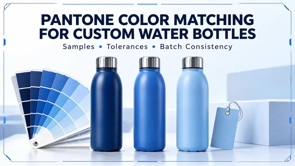
Color is one of the first decisions in a custom drinkware project—and one of the easiest requirements to communicate poorly. A buyer may request “navy blue,” send a screenshot, or provide a Pantone number and assume that the finished bottle will look identical to the monitor image, printed chip, retail box, and previous production batch.
In practice, coating system, gloss, texture, substrate, bottle curvature, lighting, measurement method, and production conditions can all change color appearance. Reliable matching therefore requires a shared physical reference and a clear approval method—not an unrealistic promise of a “perfect match.”
The Short Answer
For reliable Pantone color matching on custom water bottles:
- Specify the complete Pantone reference, including its suffix.
- Use a recent physical Pantone reference or approved product sample—not a monitor image—as the visual target.
- Define the coating, gloss, and texture.
- Approve the color on the actual bottle before mass production.
- If instrumental control is required, agree on the formula, settings, measurement locations, and limit.
- Retain an identified approval sample for inspection and repeat orders.
A Pantone code is the beginning of the specification. The approved coated sample is normally the most practical final appearance reference.
Why a Pantone Code Alone Is Not a Finished-Bottle Standard
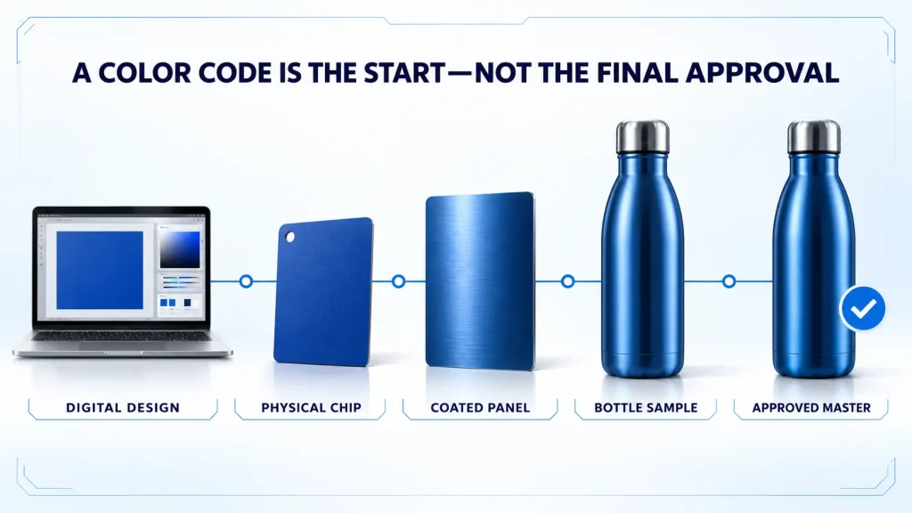
Pantone gives designers, buyers, and suppliers a common color language. However, its familiar graphics guides show ink printed on paper. Pantone explains that “C” and “U” refer to coated and uncoated paper; a powder-coated steel bottle is neither substrate. Pantone also recommends using a recent, non-faded physical standard when moving from digital design to a physical product.
For drinkware buyers, this leads to an important distinction:
- The Pantone reference defines the intended color direction.
- The physical coated sample shows how that direction is achieved on the selected bottle and finish.
If the buyer approves a coated sample that differs slightly from the paper chip, the documents should state which reference controls production. Otherwise, one team may inspect against the chip while another uses the bottle.
What Changes the Appearance of a Custom Bottle Color?
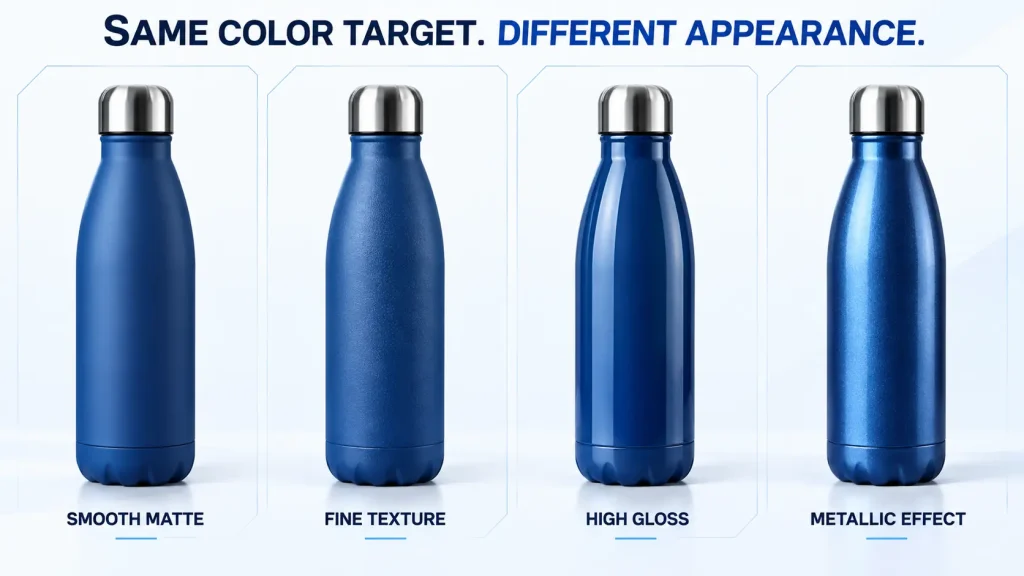
1. Coating or finishing process
Powder coating, liquid paint, soft-touch coating, metallic finishes, gradients, and electroplated effects reproduce color differently. Pigment, film thickness, primer, topcoat, curing, and application method all influence the result.
If you have not selected the finish yet, compare the practical differences in our guide to powder coating vs spray painting for stainless steel water bottles.
2. Gloss and texture
A glossy surface reflects light differently from a textured matte surface. The glossy version may look deeper, while the textured version looks softer. Even “Pantone 123 C, matte” is incomplete: specify smooth matte, fine texture, rough texture, rubberized feel, or another approved finish.
3. Substrate and undercoat
Bare steel, a white base, a gray primer, or another preparation system can affect opacity and final color—especially for light, bright, translucent, or effect finishes.
4. Bottle geometry
A bottle is curved, so its shoulder, wall, base, handle, and lid catch light at different angles. Geometry also affects instrumental inspection: an aperture that sits correctly on a straight wall may not fit a narrow neck or curve.
5. Viewing light
The same bottle can look different under daylight, warm retail light, and cool warehouse light. For brand-critical colors, define a consistent viewing environment instead of changing conditions between approvals.
6. Production variation
Preparation, mixing, film build, curing, raw-material lots, and rework can create variation within or between batches. Define and monitor acceptable variation before delivery.
What Should Buyers Include in the RFQ?
The color section of a custom drinkware RFQ should include more than one line.
| Requirement | What to specify |
|---|---|
| Color reference | Full Pantone number and suffix, or an identified physical master sample |
| Reference priority | Whether the Pantone chip, supplied product, or approved coated bottle controls production |
| Surface finish | Smooth matte, fine texture, semi-gloss, high gloss, metallic, gradient, soft-touch, or other finish |
| Product area | Bottle body, lid, handle, straw, silicone boot, or other components to be matched |
| Approval method | Visual approval, instrumental measurement, or both |
| Viewing conditions | Agreed light source or lightbox conditions when color is brand-critical |
| Tolerance | Agreed visual limits and, if used, the complete instrumental method |
| Repeat-order requirement | Whether future batches must be compared with the retained production master |
| Quantity and colors | Units per color, total quantity, and expected future reorder volume |
The rest of the project—bottle model, material, lid, decoration, packaging, market, and testing—should also be clear. Our custom stainless steel drinkware quote checklist provides a broader RFQ structure.
A Practical Color Approval Process
Step 1: Confirm the design reference
Provide the exact Pantone reference where available. Include the suffix, such as C or U, because it identifies the reference being viewed. If the target comes from an existing product rather than a Pantone guide, label and photograph the master sample and send the physical item when practical.
Do not use a color name, RGB value, hex code, screenshot, or phone photograph as the only production reference. Device calibration, camera processing, and ambient light make them unreliable as final standards.
Step 2: Confirm the finish before matching
Select the intended coating and effect first. Changing from glossy paint to textured powder may require a new approval. Likewise, a steel body, plastic lid, silicone boot, printed logo, and paper package can be visually coordinated without appearing identical.
Step 3: Review a color panel or first sample
A flat panel can reduce the cost of early adjustments, but final approval should use the actual bottle with the specified substrate and finish. Review the shoulder, straight wall, base, seams, handles, and masking lines—not only the easiest central area.
Step 4: Approve a physical bottle under controlled conditions
Evaluate the sample under consistent lighting, both alone and beside components that will be sold with it.
Record the approval with:
- Product model and capacity
- Pantone or master-sample reference
- Coating and finish description
- Sample number and approval date
- Approved logo method and placement
- Photographs for identification—not as a substitute for the sample
- Any agreed visual or instrumental limits
Step 5: Retain a controlled approval sample
Protect the approved sample from sunlight, heat, contamination, and scratching. The buyer and production partner should identify retained samples with matching records.
A retained sample is most useful when it is connected to a written specification. For a wider explanation of sample-to-production control, see our guide to quality control for custom stainless steel drinkware.
Step 6: Check first production pieces and the finished lot
Compare first production pieces before the complete batch is finished. Final inspection should then check within-lot variation, coordinated components, logo appearance, and packaging protection.
Visual Approval vs Instrumental Measurement
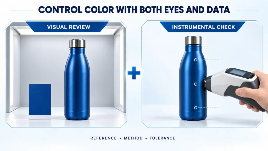
Neither method should automatically replace the other.
| Method | Strengths | Limitations |
|---|---|---|
| Visual evaluation | Reflects the buyer’s real appearance judgment; useful for complete bottles and coordinated components | Influenced by lighting, observer, surrounding colors, fatigue, gloss, and viewing angle |
| Spectrophotometer measurement | Produces repeatable numerical data when the method and surface are suitable | Results depend on instrument geometry, aperture, settings, calibration, surface shape, gloss, and texture |
| Combined method | Links measurable control with commercial appearance | Requires both sides to agree on the procedure and decision rules |
ASTM D2244 covers color differences from instrumental measurements. It says purchaser and seller should agree on the tolerance and calculation procedure and notes that gloss and texture affect the relationship between a number and commercial acceptability. A single reading on a curved, textured bottle may not describe the whole product.
What Does Delta E Mean—and What Should Buyers Specify?
Delta E, written as ΔE, expresses a calculated difference between two measured colors. A lower value generally means the measured colors are closer under the stated method.
However, “Delta E below 2” is not a complete specification by itself.
Different color-difference formulas can produce different results from the same measurements. ASTM D2244 includes several approaches, while ISO/CIE 11664-6 defines the CIEDE2000 formula. A useful procurement specification should therefore identify the method rather than writing only “ΔE.”
It should also define the reference, formula (such as ΔE00 when appropriate), instrument geometry, illuminant and observer, aperture, calibration, reading locations, averaging method, tolerance, and any visual-review rule.
There is no single Delta E limit that is automatically correct for every drinkware project. A tolerance suitable for a smooth solid coating may not be practical for a rough texture, metallic effect, gradient, translucent finish, or small curved component.
The correct limit is measurable, repeatable, commercially acceptable, and achievable with the selected process.
How to Control Color Consistency in Repeat Orders
Repeat orders create a different question from first-order approval: should the new batch match the original Pantone target, the first approved sample, or the most recent accepted production batch?
State the answer before reordering.
For stronger continuity, retain an identified production master and the coating specification; reference both in the new RFQ; confirm whether formulation or process has changed; and approve a new first article when color is critical. Compare samples under the same conditions, remembering that uncontrolled old samples can fade, yellow, become dirty, or change gloss.
Orders split across different times or processes are harder to coordinate. If several sizes or accessories form one collection, approve them as a set.
Custom color can also affect minimum order quantity because coating preparation, color mixing, line cleaning, sampling, and material purchasing carry setup requirements. See our custom water bottle MOQ guide for the wider relationship between colors, lids, packaging, and order quantity.
Body Color, Logo Color, and Packaging Color Are Separate Matches
A brand may use one Pantone reference across the bottle body, printed logo, plastic lid, silicone part, and retail box. That does not mean every component will appear identical.
- A powder-coated body uses a coating formulation on metal.
- A screen-printed logo uses ink over the finished bottle surface.
- UV printing may use a white underbase and multiple ink layers.
- A molded plastic lid uses colored resin.
- A silicone part uses its own pigment system.
- A carton reproduces color with ink on paper or board.
The goal may be an instrumental match, a close visual match, or an intentional contrast. State which one.
For logos, include a vector artwork file, identify every spot color, and confirm whether the printed result is judged against the Pantone reference or an approved decorated sample. Our comparison of UV printing, screen printing, and laser engraving explains how the decoration method affects artwork and appearance.
Common Color-Matching Mistakes
- Approving from a phone photo affected by white balance, lighting, editing, and screen settings
- Sending a Pantone number without its library or suffix
- Treating a paper chip as if it reproduces bottle curvature, gloss, texture, and film build
- Changing from glossy to matte or smooth to textured after color approval
- Writing “exact match” without a reference, evaluation conditions, or tolerance
- Measuring one convenient spot instead of representative areas
- Reordering without a retained master and clear reference priority
A Copy-Ready Color Requirement for Your RFQ
Body color target: Pantone [full number and suffix], based on a current physical Pantone reference. Finish: [smooth matte/fine texture/semi-gloss/high gloss/other]. Final approval will be based on the coated bottle sample identified as [sample number/date]. Mass production must be visually consistent with the approved sample under [agreed viewing condition]. If instrumental control is required, the parties will confirm the color-difference formula, instrument settings, measurement locations, averaging method, and acceptance tolerance in writing before production. Any change to coating formulation, finish, substrate preparation, or production method requires review before use.
This wording is a starting point. The final requirement should reflect the product, finish, brand sensitivity, order size, and inspection resources available.
How Funzlife Supports Custom Color Projects
Funzlife helps brands, importers, retailers, and promotional product companies review drinkware customization requirements before production. For custom color projects, this may include helping buyers:
- Compare suitable existing bottle models and finish options
- Clarify Pantone and physical-sample references
- Coordinate color and decorated samples with suitable production partners
- Record approved appearance and project specifications
- Align body color with lids, silicone parts, logos, and packaging
- Define first-article and final-inspection checkpoints
Because achievability depends on material and process, recommendations should be confirmed through project-specific sampling—not a universal promise based only on a code.
Explore our custom drinkware options or contact Funzlife with your bottle style, quantity, target market, Pantone reference, finish, logo artwork, and packaging requirements.
FAQ
Can a custom water bottle match any Pantone color exactly?
Not automatically. A Pantone reference gives a clear target, but the achievable result depends on the coating system, substrate, finish, geometry, and process. Approve a physical coated sample and define acceptable variation before production.
Should I specify Pantone C or Pantone U for a bottle?
The suffix identifies how the color appears in Pantone’s graphics guides on coated or uncoated paper. It does not describe a bottle coating. Send the complete reference you selected, then approve how it is reproduced on the actual bottle and finish.
Is a digital rendering enough for color approval?
No. A rendering is useful for layout and design direction, but monitors and phones display color differently. Use a current physical reference and approve a physical bottle sample.
What Delta E tolerance should I request?
There is no universal value for every bottle and finish. Agree on the reference, formula, instrument settings, measurement locations, surface conditions, and commercial acceptance limit. Combine instrumental and visual review when gloss, texture, curvature, or effect finishes influence appearance.
Will a repeat order look identical to the first order?
It can be controlled more reliably when the approved sample, coating specification, production records, and inspection method are retained. Some process and material variation remains possible, so the repeat-order acceptance standard should be stated in advance.
Final Thoughts
Pantone color matching for custom water bottles is not a one-code transaction. It is a controlled path from design intent to a physical, repeatable product.
The strongest specification combines a complete reference, defined finish, bottle sample, clear reference priority, realistic tolerance, and retained approval standard. Agreeing these elements before production makes inspection more objective and repeat orders easier to control.